Nicoll & Jack

Key Features
- Logo
- Flat design
- Custom WordPress theme
- Mobile friendly responsive design
- Business cards
- IE7+ compatible
Nicoll & Jack were established in Dundee over one hundred and fifty years ago, in 1852. After a long period trading as part of the larger Scottish Electric Services Group, they decided to become a separate firm again and started looking for a website designer in Dundee.
After getting in touch in September, they selected us to create their new logo & website.
Logo Design
Kenny Gall, the MD of Nicoll & Jack already had some logo ideas. The N&J team had decided upon two colours for the logo – orange and golden yellow. Their logic was twofold: Firstly, the colours were bright and recognisable so would stand out on a dark coloured van or clothing, secondly, much of the equipment they deal (cranes, hoists, etc) was either orange or yellow, so the colours would help to create a visual link between them and the equipment they supply and support.
Business Cards
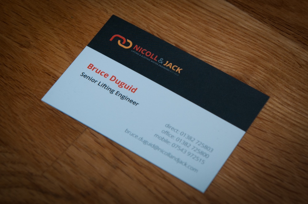
Once the logo was finalised and approved, the next thing was to create a set of business cards for the team. We created a simple, businesslike design that drew on the colours in the logo. The first design was approved and within a few days the Nicoll & Jack team had shiny new business cards to impress potential customers.
Website
Every business needs a website 🙂 and Nicoll & Jack had previously been included in the site of the larger business group they were part of. The new standalone business required a new website and we set about creating a number of potential website designs. One of the requirements that was discussed early on was for the design to be able to incorporate an e-commerce section later in the year.
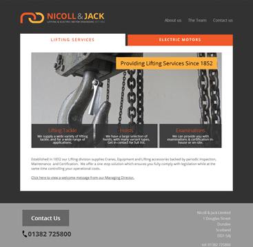
The final design that N&J selected uses a clean flat design with tabs to divide the site into two sections mirroring the two distinct markets that they sell to. A third tab can easily be added to incorporate an e-commerce section, but the site will stand on it’s own without it until that option is ready.
The consistent logo, colours, and typeface help to create the unified corporate image that Nicoll & Jack were after when they first started looking for a website designer in Dundee and got more than they hoped for!


